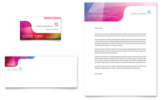
Logo and business card visual organization.
This business card has 3 different alignments. Centered, left, and right. Most of the information for the different jobs are centered while the name/number is on the left and the images are on the right.
This business card is something very fance. The card is folded to make the ninja star while the logo appears. But this is bad or people carry around because of the unusual shape of it.
The business card and logo should be very inviting. Colors used should be cool colors and not to warm. An adjacent color mode is the perfect choice.
Letter head inspiration
The inspiration choices for the letterheads were picked with the business cards to see the similarity of the two.
This photo includes the letterhead, envelope, and business card. The designs for the three are fairly similar. They have sight changes in placement but you are able to distinguish the three with the same company.
This letterhead matches the cards design on the spot. There is just more room within the logo and design.


No comments:
Post a Comment