Monday, May 7, 2012

Assignment 20 Research and Inspiration

Shepard Fairy - This man is a America Contemporary graphic designer. He started off with street designs on skateboards and t-shirts. H=One of his starting design were of the great wrestler Andre the Giant (Uncle of the Big Show).
This started off his great career until he made a big poster in 08 with Barack Obama on it with the word hope across it.
This one.


In assignment 20, we are to make a similar poster of those from Shepard, but we are to use a social issue of our choice. We can either create or redesign a logo.

The social issue that i'm focusing on is Gas/Air pollution. The main picture is of a Haze/ gas mask. The colors used are to resemble that of a poisonous gas or smog. Green of course is the best choice. I will go from a sickly green to a teal like color for the lighter regions.

I am choosing te social issue on

Color Psychology


Friday, May 4, 2012

Assignment 19 Reflections

  This is the business card for the company. The initial logo is still there. The logo represents a sauna pool with the words being the steam. The card holds the address, numbers, etc. It also holds some of the things that you can have at the spa. It could've been better with a background color, but we had a two color limit.
This is the envelope. The logo is the same at least. The pool instead is spread on the bottom for design. A large blank space is left for any add ons from the shipping companies.
The letter is fairly similar to the envelope but it is vertically oriented.  A large space in the middle for any text that people will write. The address and what now are on the bottom.

Tuesday, April 24, 2012

Assignment 19

Logo and business card visual organization.
This business card has 3 different alignments. Centered, left, and right. Most of the information for the different jobs are centered while the name/number is on the left and the images are on the right.


This business card is something very fance. The card is folded to make the ninja star while the logo appears. But this is bad or people carry around because of the unusual shape of it.


The business card and logo should be very inviting. Colors used should be cool colors and not to warm. An adjacent color mode is the perfect choice.

Letter head inspiration
   The inspiration choices for the letterheads were picked with the business cards to see the similarity of the two.
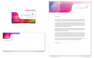
 This photo includes the letterhead, envelope, and business card. The designs for the three are fairly similar. They have sight changes in placement but you are able to distinguish the three with the same company.

This letterhead matches the cards design on the spot. There is just more room within the logo and design.

Stationary Package

   Stationary Package -  the printed pieces that the compony utilizes for communication purposes.
1. When establishing a business, it is very important that all communications are well coordinated and that the message of the organization is presented consistently.
      - Business card, Letter head, and Envelope

   Business Card
1. An essential part of a stationary package.
2. Form the immediate opinion about your company.
3. Says something about the mission of your company.
4. Typically includes: logo, employee name, company name, title, number fax/phone, address, web url, and email.
5. Design tips - must be 2"x3.5", horizontal or vertical orientation, check for accuracy, check for unity, typical margin is .25" to .125"

   Letter Head
1. a printed piece of paper used to send letters, memos, etc.
2. logo, company name, address, phone\fax number, web address.
3. 90% clear of graphics for writing use or other needs.
4. 8.5 x 11 standard), must be vertical orientation, must leave room to write the letter, check for accuracy, check for unity.

   Envelope
1. the packaging that the contains the letter/form, when being mailed. Standard #10
2. logo, company name, company address
3. 9.5 x 4.125, horizontal\vertical orientation, leave room for recipients address and stamp.

Thursday, April 19, 2012

#18 research & Inspiration

The word logos i intend to create i for St. Henri Hotels. Seeing how St. is the first word i want it so be seen first. It is rather hard to do this due to the word "St." is small. 

To see around this problem i would place St. alone and make it a more noticeable color then follow up with a lighter shade of color for the other two word.


The Dell logo gave me an idea. It is simple but it is recognizable. The E is combined to the D and the L so i might connect some letters.

Friday, April 13, 2012

Assignment 17 Research and Inspiration

Colors used in this project is specific. I will use a bold color background and a natural color to write the text. The light color should be able to stand out and be readable. The colors should be close to a blue background and a saturated color. This ford logo is a example to a blue background and white letters.


Or a common figure ground concept could work just fine depending on the logos company.


Before i go on... EA sports, its in the game. This EA and Cartoon network logo only uses white and black to make the designs.

When people see the logo i want them to see the overall design then look at the logos name. But it will be simple enough to see both at the same time almost instantly.