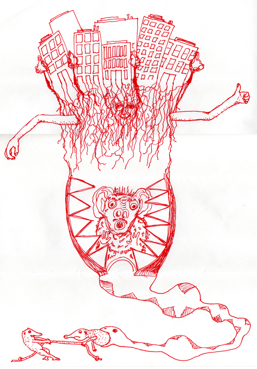
Exquisite corpse, also known as exquisite cadaver ( or rotating corpse, is a method by which a collection of words or images is collectively assembled. Each collaborator adds to a composition in sequence, either by following a rule or by being allowed to see the end of what the previous person contributed.
This method of design was created in the mid 1920's. The French Surrealist created.
Surrealism is a form of art and literature sought to release creative ideas that weren't realistic.
Spontaneous, unsuspected, dream-like, miscellaneous.
My audience is the inclosed people in my group.
This design intrigues me because instead of using normal body parts the creator used some inanimate objects and comical pictures.
The colors used here are interesting because the colors are all lightly shaded and doesn't cover all of the work.
The grayscale used perfectly blends in with the tone of this picture.
Tuesday, January 31, 2012
Monday, January 30, 2012
The Creative Process
A series of steps repeated every time you design something.
Why do we need to do this?
1. Improves consistency.
2. The ability to plan and time your work.
3. Raise the quality of your work.
4. Communicate more effectively and in a more professional manner.
Steps
1. Research
2. Brainstorm/ Inspiration
What kind of communication?
Who is my audience?
What am i trying to tell them?
What kind of colors/styles will i use?
3. Sketching out ideas for a start.
4. Execute the idea
5. Critique and revise
Make sure the design is catchy
Why do we need to do this?
1. Improves consistency.
2. The ability to plan and time your work.
3. Raise the quality of your work.
4. Communicate more effectively and in a more professional manner.
Steps
1. Research
2. Brainstorm/ Inspiration
What kind of communication?
Who is my audience?
What am i trying to tell them?
What kind of colors/styles will i use?
3. Sketching out ideas for a start.
4. Execute the idea
5. Critique and revise
Make sure the design is catchy
Friday, January 6, 2012
Photo Composition
1. Snapshots- is quick shot, often spontaneous, taken to record a moment in time.
2. Photograph- an image taken with care and thought.
Rule of thirds
3. Imaginary lines drawn dividing the frame of your camera into thirds, both horizontally and vertically.
4. Place important subject, or important elements of your composition where the lines intersect.
5. Place the horizon line at the top or bottom horizontal divider or fill up your frame for a close up picture.
Leading Lines
1. Use the lines created within the foreground or background of the composition to lead the viewer's eye through the photo.
2. Lines to draw attention to one or more intended subjects or a single focal point.
Point of View
1. Change the way your subject is perceived by changing the camera position.
2. If you are photographing a subject that you want to seem very tall, compose the shot so that the camera is looking upwards. (vice versa)
Simplicity
1. Keep your background simple and clear of clutter.
2. The mood and effectiveness of a photo can be altered by what is in the background.
3. A chaotic composition will cause the viewer to look away.
2. Photograph- an image taken with care and thought.
Rule of thirds
3. Imaginary lines drawn dividing the frame of your camera into thirds, both horizontally and vertically.
4. Place important subject, or important elements of your composition where the lines intersect.
5. Place the horizon line at the top or bottom horizontal divider or fill up your frame for a close up picture.
Leading Lines
1. Use the lines created within the foreground or background of the composition to lead the viewer's eye through the photo.
2. Lines to draw attention to one or more intended subjects or a single focal point.
Point of View
1. Change the way your subject is perceived by changing the camera position.
2. If you are photographing a subject that you want to seem very tall, compose the shot so that the camera is looking upwards. (vice versa)
Simplicity
1. Keep your background simple and clear of clutter.
2. The mood and effectiveness of a photo can be altered by what is in the background.
3. A chaotic composition will cause the viewer to look away.
Friday, December 9, 2011
Semester Reflection
This semester in Graphics Design class i have learned man things. Some of the fun things that i did was using adobe programs like photoshop and illustrator. Within some of the programs i've learned different tools to use and how to fix or create new artworks.
More things i learned was internet programming relating to elements like color usage, pixelation, resolution and other things.
Some things that i would like to learn to use would be using adobe animations.
More things i learned was internet programming relating to elements like color usage, pixelation, resolution and other things.
Some things that i would like to learn to use would be using adobe animations.
Review Week 17
I have learned that serifs were created as a curve (but not on all kinds of fonts) at the end of strokes on letters. Some other serif fonts like abrupt stops as a squarish shape at the end.
Friday, December 2, 2011
Review Week 16
How many points are in an inch? How many points are in a pica?
There are 72 points in a inch. There are 6 points in a pica.
Of the seven classifications, which classification(s) would best work as body type? Why?
Blackletter, modern, and script since they are east to make and read.
Identify the lowercase characters that have ascenders?
b,d,f,h,i,j,k,l,t
Identify the lowercase characters that have descenders?
g,j,p,q,y
There are 72 points in a inch. There are 6 points in a pica.
Of the seven classifications, which classification(s) would best work as body type? Why?
Blackletter, modern, and script since they are east to make and read.
Identify the lowercase characters that have ascenders?
b,d,f,h,i,j,k,l,t
Identify the lowercase characters that have descenders?
g,j,p,q,y
| Modern. Distinguished by the flat serifs. |
| Script. This has a pen like writing to it. |
| Decorative. This is a unusual print that brings attention. |
| Blackletter. The thick lines for the characters give a bold appearance. |
| Decorative. This is decorative since it is not a normal print but a attractive one. |
| San serif. Uniform Weight with the letters. |
| Serif. |
Tuesday, November 29, 2011
Podcast #4 Typography
Define typography?
The art of expressing ides through the selection of appropriate typefaces.
Where did the word "typography" originate from?
Greek word for from and writing.
What does typography involve?
Using words to create a illusion is a piece of work. Size, line spacing, fonts, and spacing between letters.
What is a typeface?
Distinctive designs of visual symbols that are used to compose a printed image/design.
What is another term for typeface?
Fonts
What is a character?
Individual symbols that make of a typeface.
What is type style?
Modifications in a type face that create a design variety while maintaining the visual style of the typeface.
What does type style "create" within a design?
Variety or styles to use.
What is the waist line and what does it indicate?
An imaginary line drawn at the middle of the characters.
What is a base line and what does it indicate?
An imaginary line drawn at the bottom of the characters.
What is an ascender?
The part of the character that extends above the waist line.
What is a descender?
The part of the character that extends below the base line.
Describe a serif?
A line used to put a finishing touch at the top or bottom of a character.
How can the size of the typeface be identified?
By looking at the point size.
What is a point?
The vertical measurement used to identify the size of a typeface. It measures from the top of the ascender to the bottom of the descender.
How many points are in an inch?
72
What is a pica and how many are in an inch?
6 picas are in a inch.
How many points are in a pica?
12 points.
What is body type and where can it be found?
Type sizes that range from 4pt through 12pt type. These sizes are found in places where there is a lot of text to be read.
What is the key to selecting appropriate typefaces to be used as body type?
Readability
What is display type and how is it used?
Type sizes above 12pt. Used to draw attention to a message.
What is reverse type and when would it be used?
Consists of white type on a solid black or darker color background.
What is a typeface classification?
A basic system for classifying typefaces.
When was Blackletter invented and how was it used?
It was created in the mid 1400s. It was used for the printing press.
Describer the characteristics of a Blackletter typeface?
Resemble calligraphy and highly ornamental with thick and thin strokes.
When was Old Style invented and what was is based on?
Also created in the 15th 16th century. Used for the printing press.
Describe the characteristics of an Old Style typeface?
Based on Roman inscriptions. Have wedge shaped, angled serifs and a low contrast of their thick/thin strokes.
When were formal scripts developed?
17th and 18th century.
When were casual scripts developed?
20th century.
Describe the characteristics of a Script typeface?
Forms made with flexible brushes or pens and have varied strokes reminiscent of handwriting.
When was Modern typefaces developed and why?
Late 18 and 19th centuries. A radical break from traditional typography of the time.
Describe the characteristics of a Modern typeface?
Have sharp contrast between thick and thin strokes and have thin flat serifs.
How early can Sans Serif typefaces be found? What happened?
the 5th century.
When did they become popular?
in the 1920s.
What does "sans serif" mean?
Without serifs.
Describe the characteristics of a Sans Serif typeface?
Its strokes are uniform in weight and have a monotone appearance.
When was Slab Serif developed and why?
In the 19th century for advertising appearance.
Describe the characteristics of a Slab Serif typeface?
It has a uniform line weight and thicker, square serifs.
Describe Decorative typefaces?
A variety of typefaces and typically those that do not belong together.
Why were they developed?
To look flashy.
What are they best used for?
Larger point sizes.
The art of expressing ides through the selection of appropriate typefaces.
Where did the word "typography" originate from?
Greek word for from and writing.
What does typography involve?
Using words to create a illusion is a piece of work. Size, line spacing, fonts, and spacing between letters.
What is a typeface?
Distinctive designs of visual symbols that are used to compose a printed image/design.
What is another term for typeface?
Fonts
What is a character?
Individual symbols that make of a typeface.
What is type style?
Modifications in a type face that create a design variety while maintaining the visual style of the typeface.
What does type style "create" within a design?
Variety or styles to use.
What is the waist line and what does it indicate?
An imaginary line drawn at the middle of the characters.
What is a base line and what does it indicate?
An imaginary line drawn at the bottom of the characters.
What is an ascender?
The part of the character that extends above the waist line.
What is a descender?
The part of the character that extends below the base line.
Describe a serif?
A line used to put a finishing touch at the top or bottom of a character.
How can the size of the typeface be identified?
By looking at the point size.
What is a point?
The vertical measurement used to identify the size of a typeface. It measures from the top of the ascender to the bottom of the descender.
How many points are in an inch?
72
What is a pica and how many are in an inch?
6 picas are in a inch.
How many points are in a pica?
12 points.
What is body type and where can it be found?
Type sizes that range from 4pt through 12pt type. These sizes are found in places where there is a lot of text to be read.
What is the key to selecting appropriate typefaces to be used as body type?
Readability
What is display type and how is it used?
Type sizes above 12pt. Used to draw attention to a message.
What is reverse type and when would it be used?
Consists of white type on a solid black or darker color background.
What is a typeface classification?
A basic system for classifying typefaces.
When was Blackletter invented and how was it used?
It was created in the mid 1400s. It was used for the printing press.
Describer the characteristics of a Blackletter typeface?
Resemble calligraphy and highly ornamental with thick and thin strokes.
When was Old Style invented and what was is based on?
Also created in the 15th 16th century. Used for the printing press.
Describe the characteristics of an Old Style typeface?
Based on Roman inscriptions. Have wedge shaped, angled serifs and a low contrast of their thick/thin strokes.
When were formal scripts developed?
17th and 18th century.
When were casual scripts developed?
20th century.
Describe the characteristics of a Script typeface?
Forms made with flexible brushes or pens and have varied strokes reminiscent of handwriting.
When was Modern typefaces developed and why?
Late 18 and 19th centuries. A radical break from traditional typography of the time.
Describe the characteristics of a Modern typeface?
Have sharp contrast between thick and thin strokes and have thin flat serifs.
How early can Sans Serif typefaces be found? What happened?
the 5th century.
When did they become popular?
in the 1920s.
What does "sans serif" mean?
Without serifs.
Describe the characteristics of a Sans Serif typeface?
Its strokes are uniform in weight and have a monotone appearance.
When was Slab Serif developed and why?
In the 19th century for advertising appearance.
Describe the characteristics of a Slab Serif typeface?
It has a uniform line weight and thicker, square serifs.
Describe Decorative typefaces?
A variety of typefaces and typically those that do not belong together.
Why were they developed?
To look flashy.
What are they best used for?
Larger point sizes.
Subscribe to:
Posts (Atom)


